Fizzslоts
An iGaming platform for multi-regional audience with a strong focus on simplicity and intuitiveness.Roles
• User Experience (UX)• User Interface (UI)
• Interaction designer (IxD)
Deliverables
• Competitive analysis• User tests
• Userflows
• Design systems
• Prototypes
• Usability tests
Tools used
• Figma• Photoshop
• Illustrator
• After Effects
Introduction
iGaming, also known as online gambling, is a multi-billion
dollar industry. Its global reach and mobile availability
bring about numerous challenges. Factors such as regional
regulations and responsible gambling need to be considered
alongside important topics like security, fraud, and user
verification. All of this must be managed while maintaining
the key value cherished by player - fairness and transparency
of the brand. Handling all of these aspects simultaneously is
a tough task.
 Chеrry Suprеmе by Slоtmаtrix, an example of one of the games
Design approach
Upon joining the project, I quickly realized that our goal had
been established long ago - to create a product that
distinguishes itself through its modernity, transparency, and
proactive approach to addressing the problems that afflict
similar products.
The proposed design approach aimed to prioritize simplicity in
both functionality and visuals. This decision was made
considering the vibrant nature of game thumbnails, which would
cover most of the user's screen. It was also essential to
strike a balance between uniqueness and familiarity to
captivate all the new users. When entering a saturated market
dominated by strong competitors, it is crucial to maintain
high hopes for novelty while focusing on the fundamentals.
Research
Every user essentially seeks the ability to register, deposit,
find, and play the game. Competitor analysis has shown that
most other products attempt to follow a common pattern to make
this basic flow as smooth as possible. This is not only to
create a sense of familiarity, but to avoid any unnecessary
friction from reinventing it. Additionally, users are
attracted to generous gifts and bonuses, so anything that
simplifies the registration or verification process is highly
valued. However, it is not always feasible to bypass these
requirements, so it has become one of the challenges to please
both the user and the business.
 Analysis of several competitors
Findings
Competitors had several problems we aimed to resolve:
• Overloading their products with functionality - the more they were on the market the more they tried to become a jack of all trades,
• Overloading their products with visual noise - if you’ve been to Tokyo’s busy areas this will be familiar. Creating a gambling website that is as serene and empty as a Zen garden would completely kill the mood. I had to use a basic rule of graphic design, but with a grain of salt. The challenge was to control the viewer's attention, even with the flood of thumbnails and banners in the view. Fortunately, pages unrelated to gaming would not have any of those distractions.
Deepening user empathy
If we exclude fraudulent users who exploit such products,
there are two types of users: call them casuals and pro
gamblers. Casuals can include newbies who have recently
discovered this form of entertainment, as well as experienced
users who have been enjoying these products for years and are
satisfied with the surface-level entertainment they provide.
Pro gamblers, on the other hand, are typically experienced
players who go the extra mile. They stay updated on games with
higher chances of winning, understand how bonuses work, and
have high expectations in this regard. These players are
proactive and strive for efficiency. If they encounter any
issues or glitches, they will not hesitate to abandon the
product.
 Persona examples, images by freepik.com
Creating structure
Working solely with the base flow is insufficient. The product
requires verification, security measures, restrictions,
payment integration, game history tracking, and other
interactions. Creating a user flow was crucial to identify any
potential issues or areas where the user experience could be
enhanced, with the goal of streamlining a process that is
typically complex.
 Userflow of the whole product, including an admin dashboard
Exploring common tasks
Flow analysis revealed that our primary pain points in the
user experience were related to technical disruptions that we
couldn't completely control. These disruptions included issues
within the chosen payment system, user’s connection quality,
or slow server responses. To address these issues, we
developed clear, concise and reassuring dialogues.
Another set of pain points occurred during the verification
process, which only begins when a user decides to withdraw
money from their account. To prevent things like money
laundering, users are required to upload necessary documents.
Any friction in this process mainly arises from interactions
between the user and our support team. Our goal was to make
the process crystal clear by providing guidance on the page
before the interaction with a specialist was to happen.
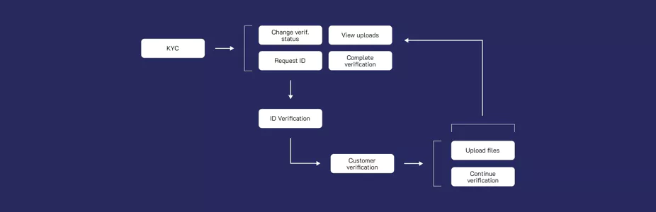
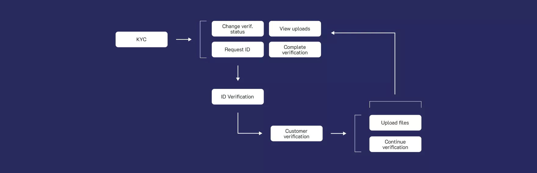 Verification flow
Defining important tasks
Essentially, the main factor for both businesses and users is
money. Businesses aim to cater to users by integrating their
preferred payment systems, allowing seamless money transfers
to their accounts. Users seek assurance that the product
they're using ensures fairness, with losses limited solely
within games rather than encountering them during money
transactions. While these products are used for gaming, the
games on coins with no alternatives.
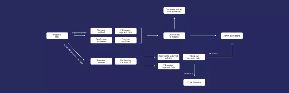
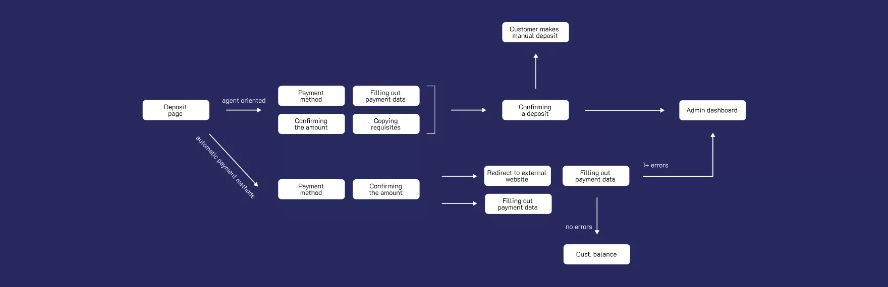 Deposit flow
Identifying design patterns
To speed up the process, we quickly did ugly sketches during
meetings, and the majority of our experimentation took place
through wireframes behind the computer. From the start, we had
a clear vision: prioritize familiarity by taking most of the
screen for games’ thumbnails. However, it's important to note
that unregistered users without funds couldn't access these
games. This concept was well understood by most users and was
essential for engagement in such products.
 Examples of several wireframes
Designing information hierarchy
Testing interactions with wireframe prototypes revealed
several key issues:
•
Balancing content volume on pages proved crucial. For
gaming-focused pages, specific sizing for each category
helped with quicker scanning and finding desired items.
However, for complex topics, reducing text and defining
visual categories aided users in focusing on completing the
task,
• Prioritizing navigation elements was a necessity. With various options available, understanding the primary user flows helped identify where links to secondary functionality would enhance user experience, particularly on limited mobile screens.
• Prioritizing navigation elements was a necessity. With various options available, understanding the primary user flows helped identify where links to secondary functionality would enhance user experience, particularly on limited mobile screens.
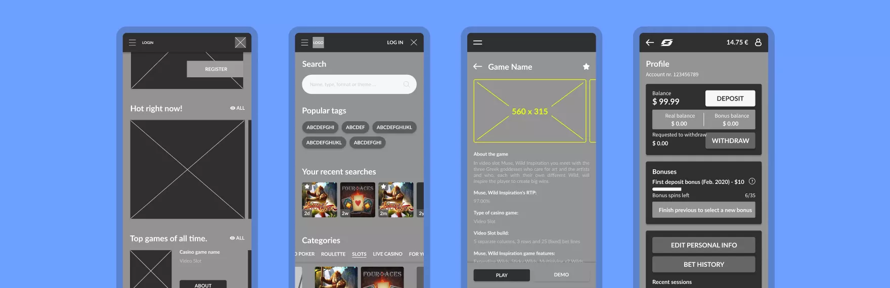
 Pilot high fidelity version
Establishing visual design
We approached our pilot version not for its flashy appeal, but
for its solid foundation in a functional design system and
clear information hierarchy.
In the meantime, as the need to work on another project arose,
we requested concepts for a more relatable look of the product
and used the results to modify our design components.
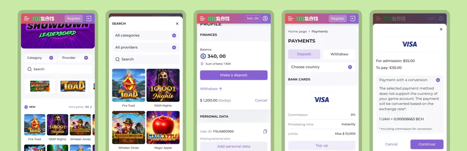
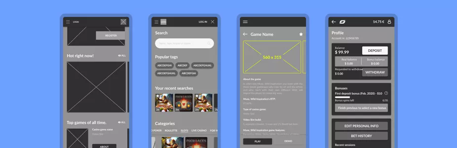
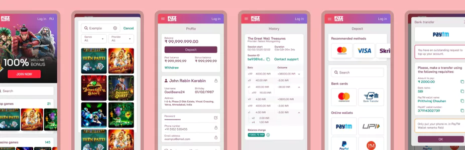
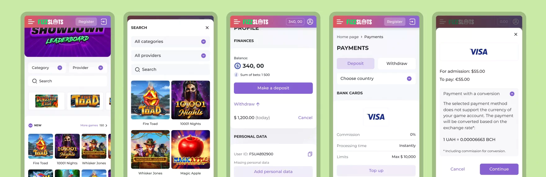 Final mobile designs, left to right: home page, search,
profile, payments preview, deposit dialogue step
Final mobile designs, left to right: home page, search,
profile, payments preview, deposit dialogue step
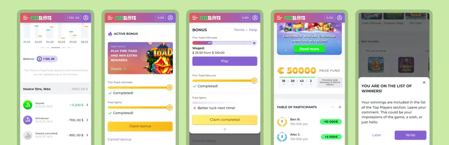
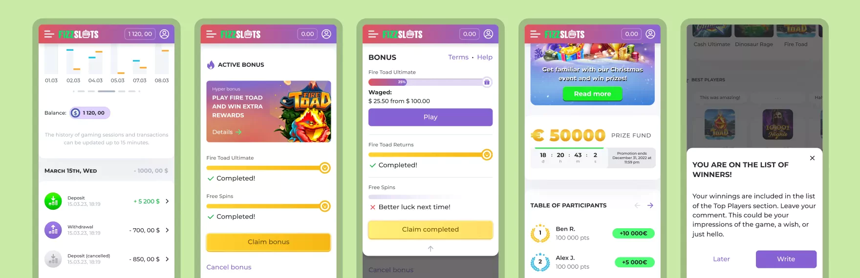 Final mobile designs, left to right: statistics, bonuses,
bonus dropdown, event page, comment interaction
Final mobile designs, left to right: statistics, bonuses,
bonus dropdown, event page, comment interaction
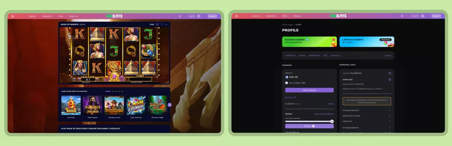
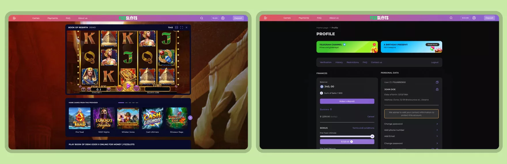 Final desktop designs, left to right: game page, profile page
with dark mode
Final desktop designs, left to right: game page, profile page
with dark mode
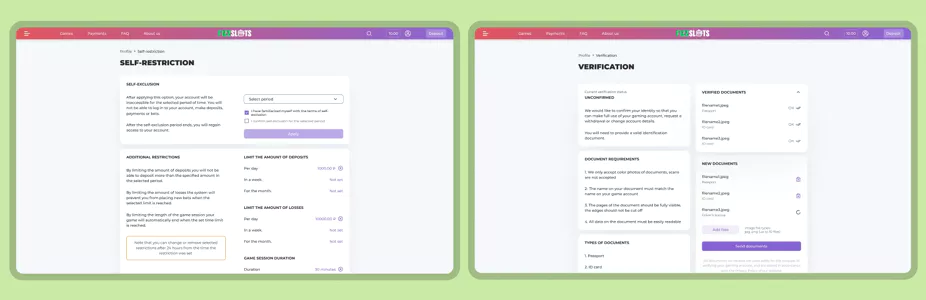
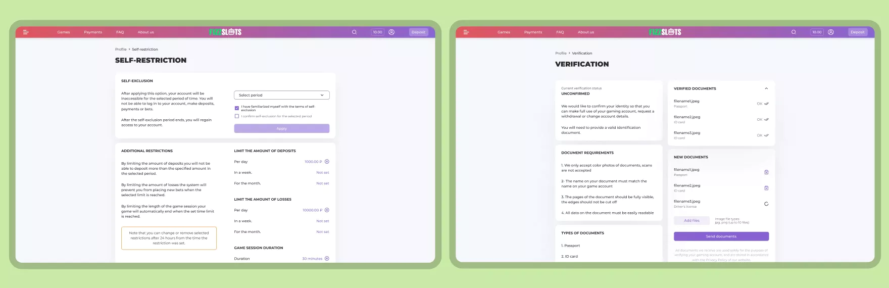 Final desktop designs, left to right: self-restriction,
verification
Final desktop designs, left to right: self-restriction,
verification
How to improve
With a slight restructuring of the project's management, the
original values of transparency and simplicity have gradually
taken a back seat. Rather than refining existing elements,
there's been a shift toward quantity over quality, resulting
in a decline in overall quality. Taking a step back would’ve
been perfect, but the contrary decision was also quite
expected.
Lessons learned
1. Even in a completely new field, achieving remarkable
results is always possible with an understanding team willing
to offer guidance and share their expertise.
2. It's a must to have more than one designer in a project,
even if there's not that much work. As Alan Watts once said,
"I
f you don't argue with me, I don't know what I think".