Backoffice
An internal web tool designed for the entire company and its partners, enabling seamless administrative tasks, client management, transaction handling, and product configuration.Roles
• User Experience (UX)• User Interface (UI) designer
Deliverables
• Prototypes• Surveys & user tests
• Userflows
• Design systems
• Usability tests
Tools used
• Figma• FigJam
• MUI
Overview
While using pre-made software is an option for managing a
project, when aiming to sell your end-product as a
white-label, a customized management and configuration space
bundled with it becomes essential.
Those who collaborated with me had prior experience with
similar apps, so grasping the primary functionality was clear
from the beginning. We began work after the product's
prototype went live, allowing us to gradually merge essential
features and test them iteratively.
Design approach
In essence, the tool had to resemble several small projects
within a larger space, catering to the requirements of
different teams. Given the extensive list of required and
potential functionalities, thorough implementation and careful
consideration were essential for each topic.
Creating distinct user personas wasn't necessary, considering
there might always be people handling various tasks, from
accessing customer data to managing payments and technical
aspects, all simultaneously. Therefore, it became crucial to
map out the flow of every potential task and its integration
within the overall product management process.
Creating structure
Key areas were:
•
Working with customer data, verification, account history
and logs,
• Monitoring and handling transactions,
• Setting up payment methods and payment channels,
• Adding and modifying games and arranging them into categories,
• Managing events, bonuses, promo codes,
• Configuring technical things that I can’t even pronounce.
• Monitoring and handling transactions,
• Setting up payment methods and payment channels,
• Adding and modifying games and arranging them into categories,
• Managing events, bonuses, promo codes,
• Configuring technical things that I can’t even pronounce.
Heightening user empathy
The analysis revealed that only specific sections, such as the
customer and transaction pages, were directly impacted by
website events, while the rest constituted a passive structure
within the product.
Attention was crucially directed toward the active components,
particularly payment transactions. Despite their
reversibility, implementing additional layers of protection
against human errors remained a priority.
The primary challenge often originated from the volume of data
and the functionalities supporting it. Users unfamiliar with
the tool regularly felt overwhelmed and disoriented, as
anticipated. Therefore, it was consistently prioritized to
gather and consider feedback, aiming to progressively shape a
more intuitive information hierarchy.

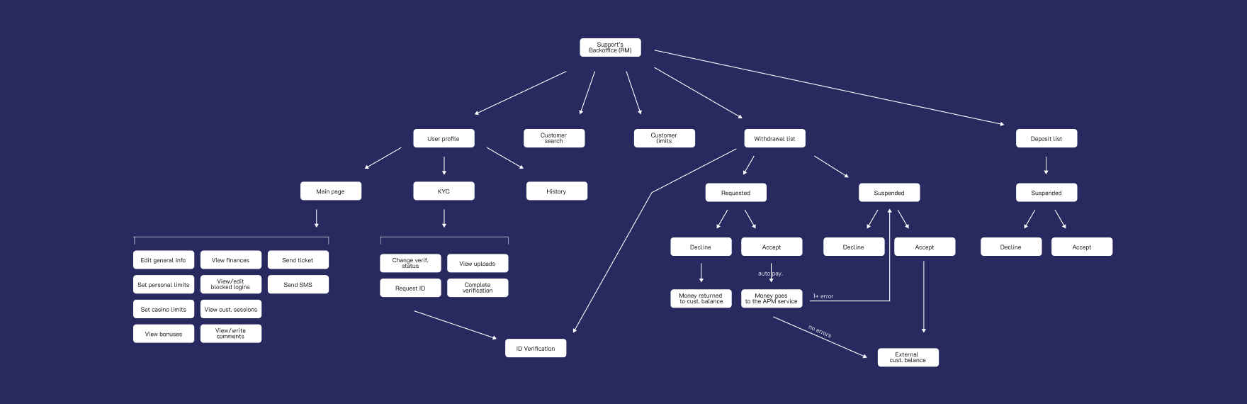 Customer management flow
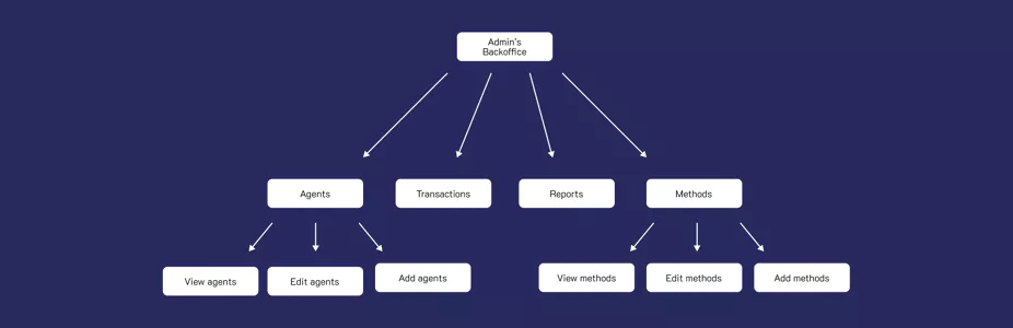
 Administrative flow
Visualizing a seamless integration
Building on insights from colleagues experienced in using
similar tools for similar products, our approach largely
revolved around working with hypotheses on functionalities and
a dash of inspiration from online design resources.
Thankfully, everyone was on the same page to create a
lightweight and intuitive tool.
Although the tool was ultimately meant to be integrated into a
marketable product, its initial use within our team justified
our decision to develop it just with the in-house feedback.
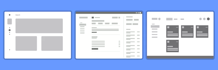
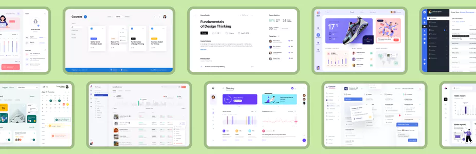 Design inspiration
Understanding the intuitive
Once our design prototypes were ready, we promptly engaged
team members for feedback and brainstorming sessions. They
immersed themselves in the designs, simulating real-world
usage with possible data and various scenarios. This method
proved unusually effective, since the primary measure for
testers was a logical layout and intuitive information
hierarchy. Adapting to the software's complexity was
anticipated, as is typical with complicated tools. Another
benefit of such approach - it was very time-efficient due to
an urgent need (nothing new).
 Wireframe trials
Establishing a design system
Aiming for a clean and visually appealing outcome, we quickly
selected neutral and inclusive colours. Our focus
predominantly centred on developing a versatile design system,
aiming for adaptability to accommodate various data types
efficiently. We planned out essential components to support a
wide selection of scenarios across the site. The challenge
laid in anticipating size variations of incoming data and
integrating associated functionalities seamlessly with these
components.
As it was exclusively intended for desktop use, our focus
remained dedicated to that platform alone. We had plans for a
compact mobile overview dashboard, but those were set for the
future, waiting until the major part of the tool to be
finalized.
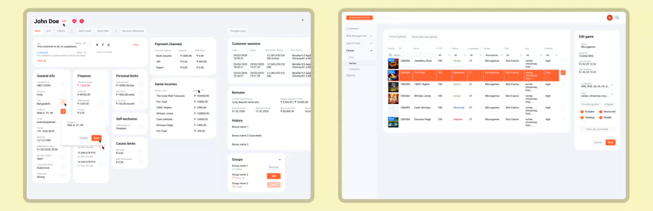
 Initial hi-fi designs, left to right: customer profile, game
configuration
Initial hi-fi designs, left to right: customer profile, game
configuration
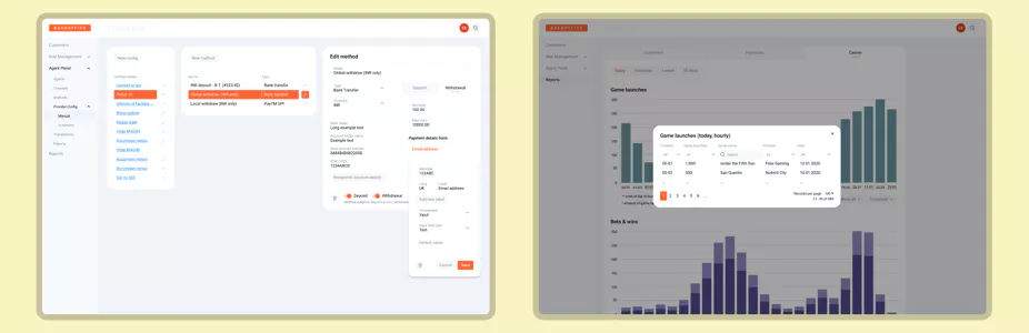
 Initial hi-fi designs, left to right: payment method
configuration, reports popup
Initial hi-fi designs, left to right: payment method
configuration, reports popup
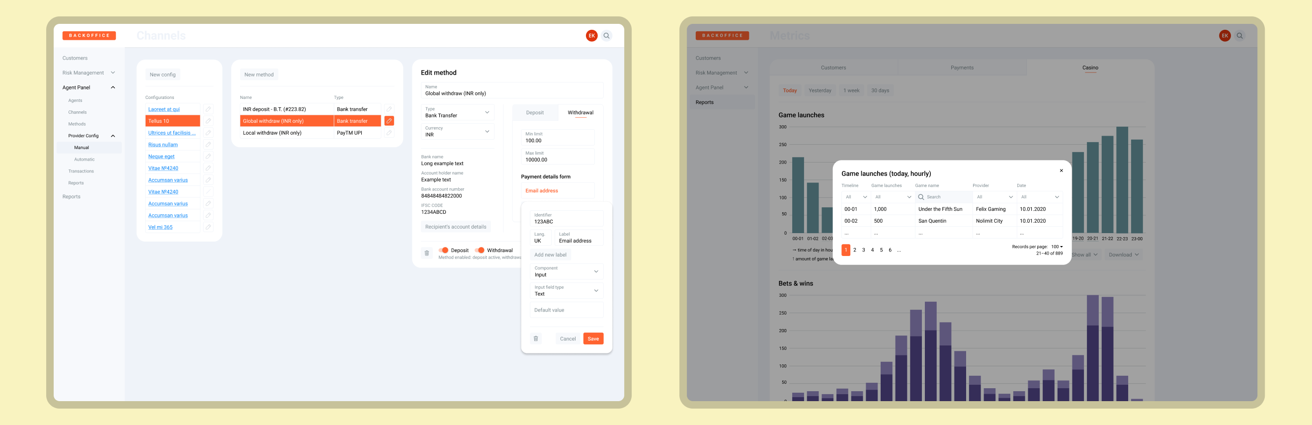
Trying new things
We relied on this design for a considerable amount of time
until the announcement of new significant features. Using the
moment, we started the transition from our custom structure to
a pre-made framework. We configured it to seamlessly
accommodate existing features and prepped for upcoming
additions. We not only designed, tested, and implemented new
features into the updated framework but also had the
flexibility to modify the framework itself to accommodate
functionalities it initially couldn't support.
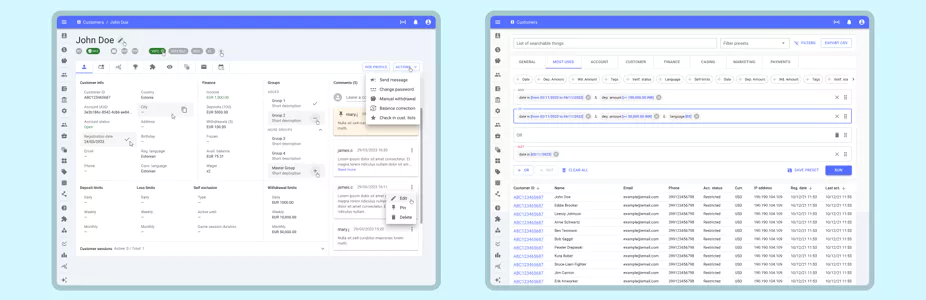
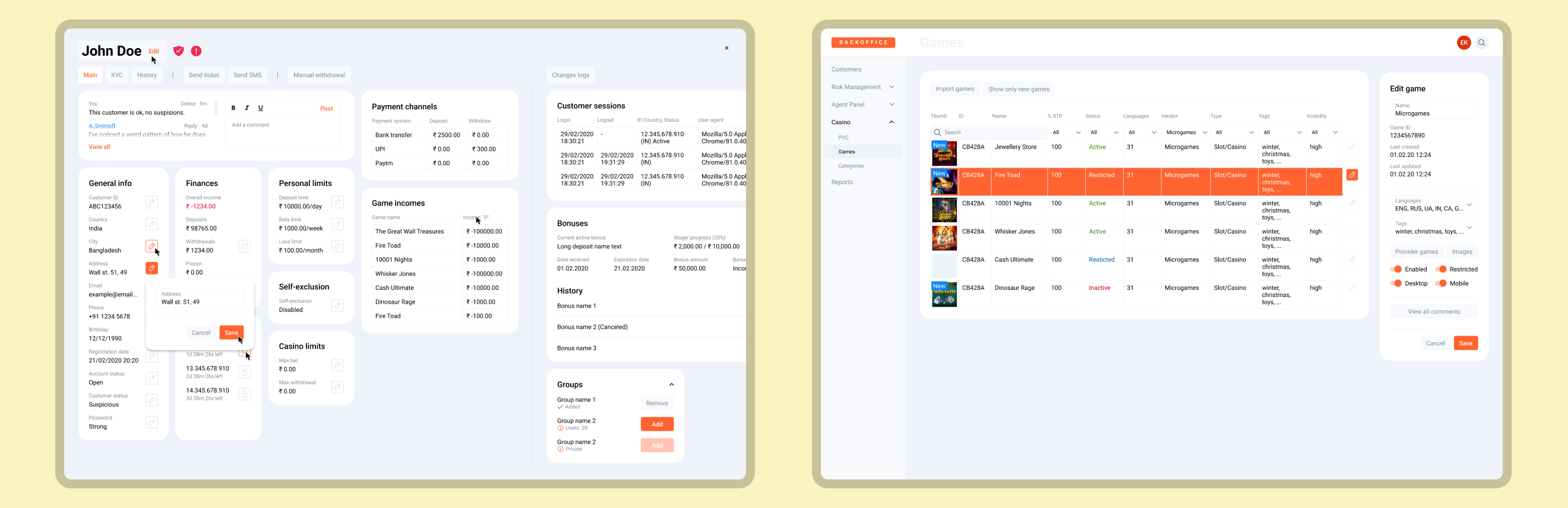
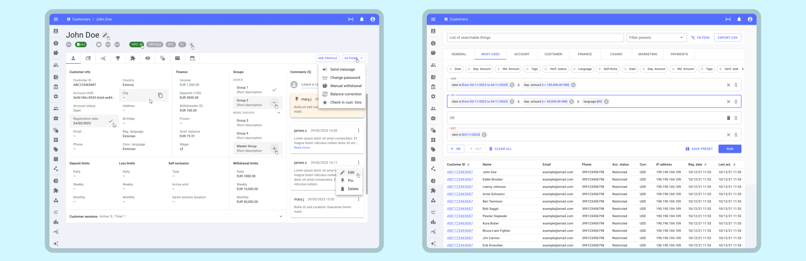 Final designs, left to right: customer profile, customer
search with an advanced filtering
Final designs, left to right: customer profile, customer
search with an advanced filtering
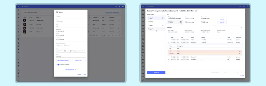
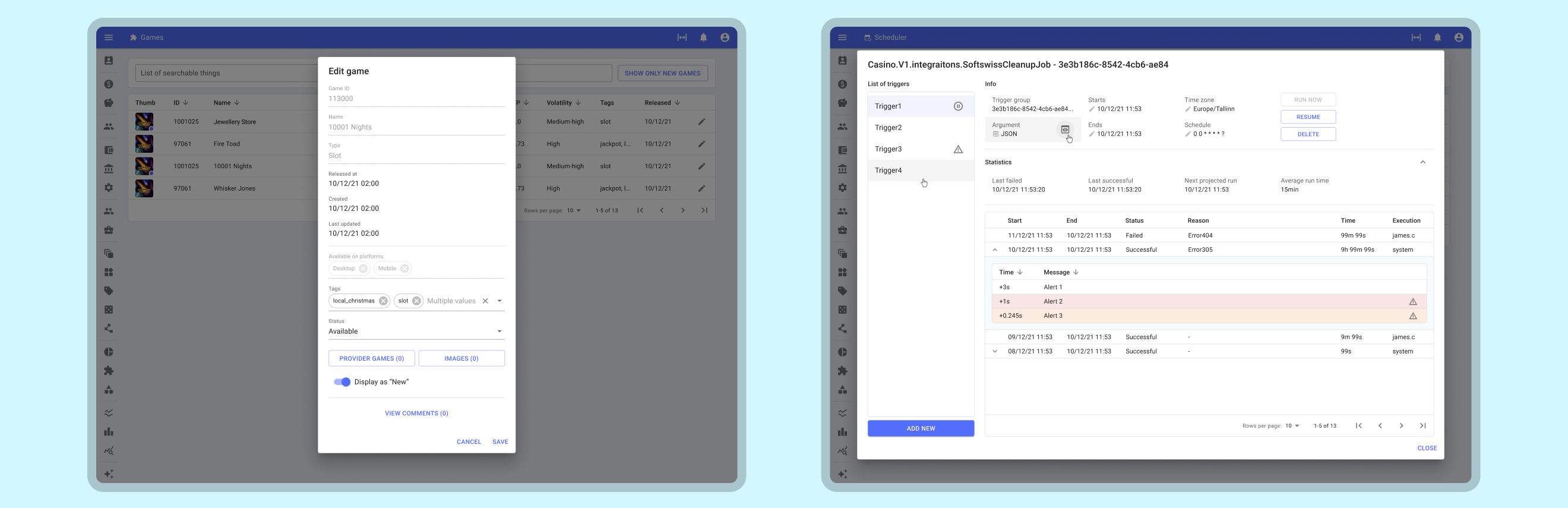 Final designs, left to right: game configuration popup,
integrations scheduler popup
Final designs, left to right: game configuration popup,
integrations scheduler popup
Next steps
Unfortunately, the project was put on hold mid-development.
One significant advantage we realized was the power of
in-house testing, with actual users sitting alongside the
designer. When the project resumes, conducting easy usability
tests is valuable, but they might carry biased views. The
challenge lies in testing with unbiased users who lack similar
experiences or context. While it's possible to have them
complete tasks like finding a specific button, simulating real
scenarios' pressure is a different story.
Lessons Learned
1. Utilizing a premade framework is significantly more
time-efficient, approximately tenfold faster than building one
from scratch (no surprises there). Surprisingly, these
frameworks can be moulded to suit your needs with minor
adjustments.
2. Simulating high-stress scenarios, such as time constraints
resembling fraudulent activities or transaction errors,
provides notably different outcomes. However, it's vital to
acknowledge that such scenarios don't always reflect the norm,
as most work occurs in a more relaxed environment.